We Found The Best & Worst Digital Ads Of Last Year …And One Epic Fail
Looking for the best and worst digital ads? The truth is we didn’t have to go searching far for these examples. These ads came to us.
Remarketing ad creative continues to be where brand positioning goes to die. Discovery and awareness creative in digital ads is regularly unimaginative in its storytelling.
Occasionally you get a memorable digital ad such as Green & Blacks organic chocolate. The rest? We’ll let you be the judge of that.
—
#1 The Best Digital Ad of 2020 (for a chocolate bar and we are definitely not 100% biased)
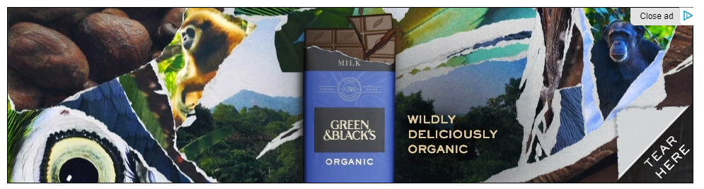
What’s one of the best things about eating PROPER chocolate? Tearing off the wrapper!
When you’re paying that little bit more for Green & Blacks organic chocolate, good foreplay is part of the experience. In this example we see a digital ad where the creative absolutely nails this down.
The only way they could make this ad any better would be if it featured Regé-Jean Page of Netflix’s Bridgerton asking you to tear it off. Too much? Hey we’re just throwing ideas out there. Y’know before Cadburys read this and wonder why they’re not reaching chocoholics like us. Hmmmmm, chocolate.
—
#2 The Worst Remarketing Ad of 2020
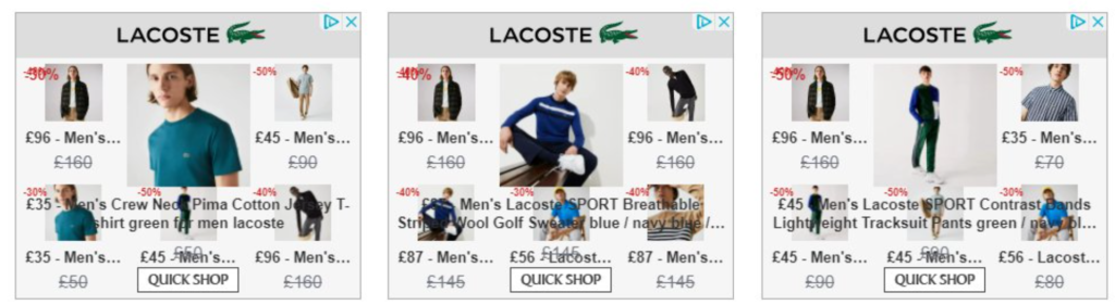
Ad-tech platforms and particularly Google have no interest in your branding. If ever there was a candidate for the ‘I’d like to report a crime‘ meme, this is it.
Last click KPI focused adtech wants you to conform your brand identity into the same generic template, or ad messaging straightjacket, as every other brand.
Marketing for adtech might call it “dynamic creative templates” or some other nonsense. They plug in your product feed and off it goes.
A creative designer can create beautifully emotive, unique HTML5 ads that surprise and delight people. Or you can plug into a generic ad platform template and end up with something like this crime scene.
That sound you hear? That’s all my Lacoste shirts and knitwear weeping at the tragedy of it all. And possibly The Kooples latest collection drop eyeing up my credit card.
—
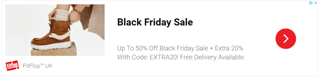
#3 The Laziest Creative Digital Ad of 2020 (often for Black Friday)

Maybe we’re wrong. Maybe the combination of faux clip art and is-it-red-or-orange-with-black together creates killer CTR.
Maybe out of millions of products Amazon has to choose from, a grey sweater without a model is the one with the highest conversion rate.
I mean it’s not impossible. But having been involved in creating digital assets since the dawn of the internet, I have my doubts. This looks like it was designed (and I use the word designed very loosely here) based on a previous ad creative winner. If it ain’t broke… someone once said.
If ever there was an example of repeating last year’s creative as self-fulfilling KPI prophecy, it’s this. New customers are more expensive to acquire as your reach expands (law of inefficient click-throughs) and this looks a lot like what you use when you’re not even trying. Or you simply need to burn through enough ad budget to not get less next year.
In Amazon’s defence, Black Friday ad creative is rarely on-brand. Mostly it just comes across as a bit desperate.
Dynamic ad templates used in Google Display Network might be effective but with a little more effort the creative could be better than this alternative example below. Especially as we know how talented these digital teams can be. It’s another example of following last click KPI as a religion over using branding to trigger the action you want.
Performance marketing involves storytelling. Anyone who says different doesn’t understand marketing full stop.
—
#4 Feed Based Remarketing Done Right
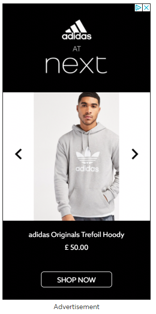
Spotted on Ticketmaster, this ad by NEXT manages to succeed where LACOSTE failed. It’s a dynamic ad template. They’ve plugged in a product feed. You can scroll through a few products, and – crucially – it doesn’t make we want to pull my eyes out.
It’s clear, simple, and almost elegant. I mean, you arguably can’t be elegant at scale but this comes as close as you can get for the high street retailers.
For several years now NEXT’s ecommerce team have consistently excelled and along with Farfetch and ASOS continue to set the benchmark for the rest of the UK-based industry.
—
#5 The Importance of the Photographic Angle
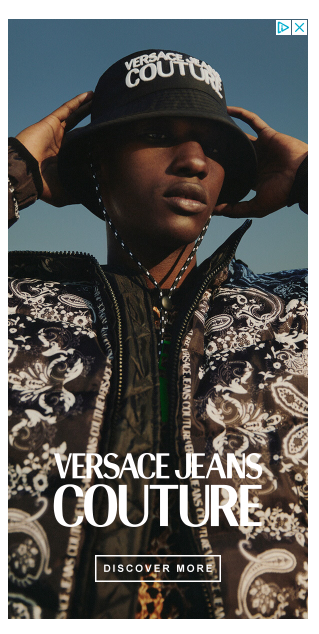
This display PPC ad example by VERSACE JEANS is excellent.
Testing has shown that model shots do tend to outperform their non-model counterparts.
We have seen exceptions where the shot angle lends itself to allowing the viewer to imagine themselves wearing or using that piece of clothing or accessory.
The trap of creating a bland accessory shot is real. In isolation a product image can look OK. It’s when you squeeze it into half of the ad template that it degrades from OK to uninspiring.
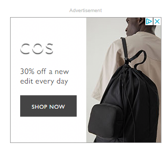
The photographer taking this shot for COS likely didn’t have this ad template in mind.
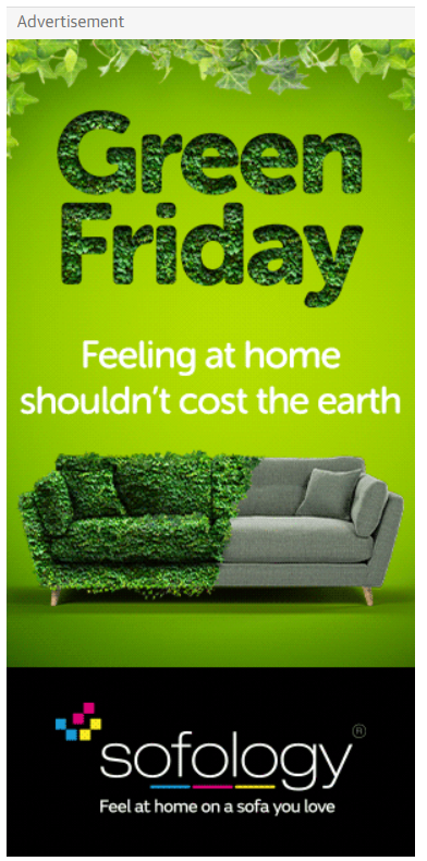
#6 Creative Ad That Actually Succeeded In Being Creative
The idea of covering half a sofa with ivy or green leaves to promote your green credentials might trigger pushback from certain sustainability experts.
From an ad creative perspective, it is incredibly eye-catching. It made our shortlist of the best display ad examples easily.
Notice how it doesn’t have a call to action button because the brand logo acts like one. In fact, if there was a SHOP NOW button it would devalue the storytelling.
Even the tagline uses the emotional trigger words ‘feel’ and ‘love’. This is going straight for your heart and it does not miss. Kudos sofology.
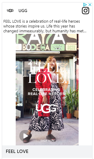
#7 The Epic Fail Ad of 2020. It Used Too Many Resources So Chrome Blocked It. Ouch.
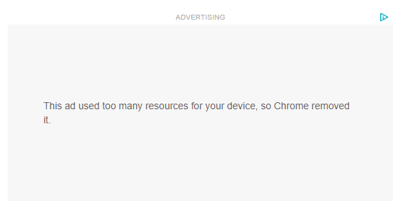
After numerous attempts to find out which creative ad was being actively BLOCKED by Chrome, we cracked it.
OK admittedly we had to stop using the Chrome browser, trigger the ad in Instagram, and then get it to appear later in Chrome for a nanosecond before Chrome rebooted the entire page – but hey – the award for the Epic Fail ad of 2020 goes to UGG Boots.
How did this happen? Most likely this lack of attention to detail happened due to a tendency to throw money at problems as a way to solve challenges. When it comes to enterprise level brands… This Is The Way.
As we’ve seen earlier with Lacoste, Criteo ad templates don’t always load correctly. The biggest adtech partners operate at a huge scale meaning there isn’t the kind of attention to detail you get when it’s a custom tailored solution.
What have we learned about display advertising?
- Great creative in display advertising doesn’t always need a conventional Call To Action button (Green & Blacks) or even a CTA at all (Sofology).
- Black Friday creative that abandons storytelling to win the click at all costs looks desperate. Most brands are guilty of this!
- Display remarketing templates should be tested thoroughly to avoid brand disasters. Criteo and Google Display Network generic templates look generic at best.
- Product feed based display remarketing can look good if you put the effort in (NEXT excel at this).
- If your creative doesn’t even load and is blocked by the Chrome browser, that is an Epic Fail!